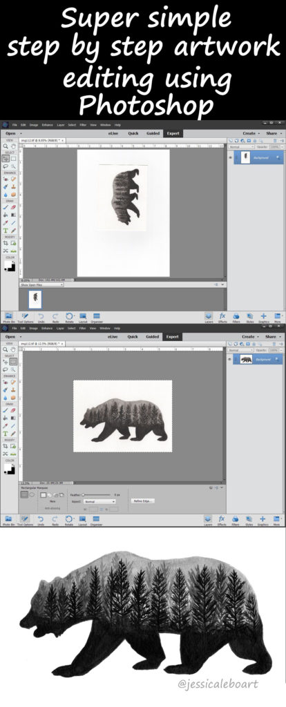
Welcome! So you have a picture or scan of your artwork! But now what in the world do you do with it?!
Today’s post is a very, very basic Photoshop editing lesson.
I’ve heard people say that they can’t figure out Photoshop (you could say any editing program in there as well), and use that as an excuse to not take the steps they want to start selling. While Photoshop can do amazing and incredible things, you only really need a few of those features at this point. Even if you’re not trying to sell, but want to post better pictures of your artwork to social media, a quick edit can drastically improve things.
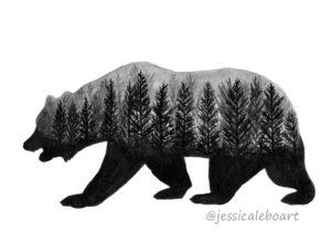
For this example, I’m going to be editing this ink bear that I painted, a fun little project experimenting with double exposure.
This is the order that I did the steps in, but often steps can be done in a variety of orders. For example, you may want to save the image as the first step (especially if it’s storming), I just have a habit of doing that last (hey, not all habits are good!)
I have my image scanned, and I open it with Photoshop.
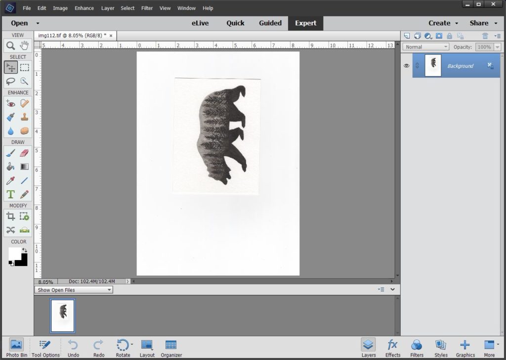
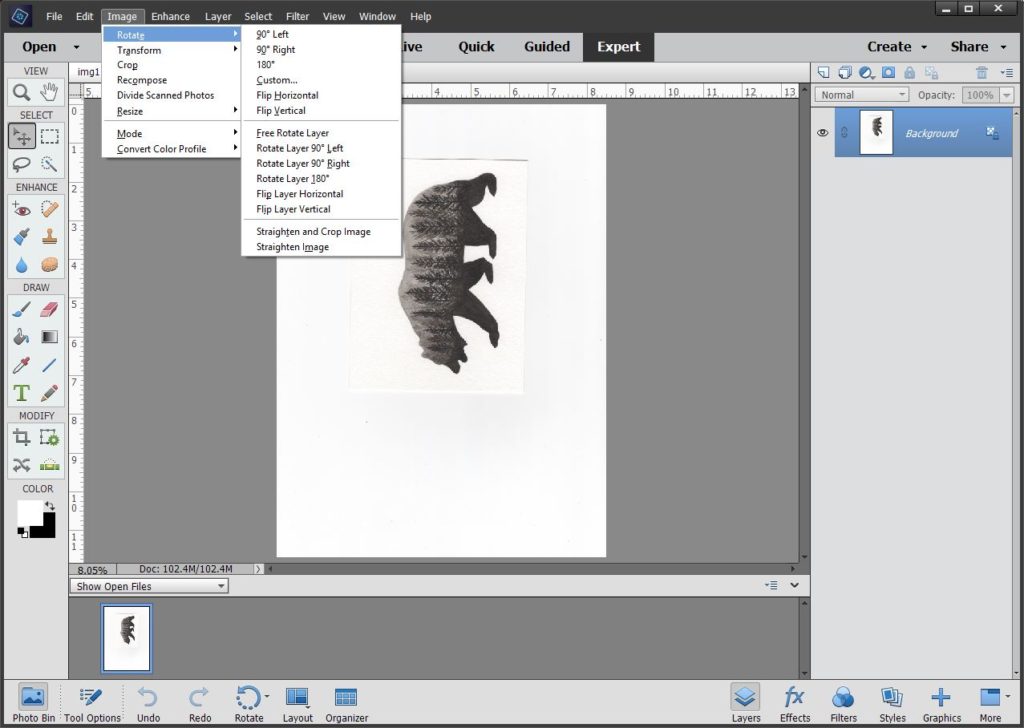
First step is to rotate the image. Determine which rotate is appropriate for your picture, unless you photographed or scanned it the correct way to start with.
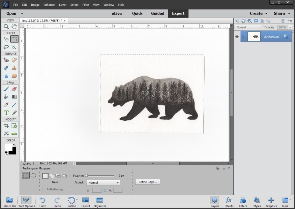
Then we need to crop to get rid of the area around the picture. Click the rectangular marquee tool, and select the part you want. After selecting it, sometimes you need to adjust the area. As you can see here part of my selection is off the picture.
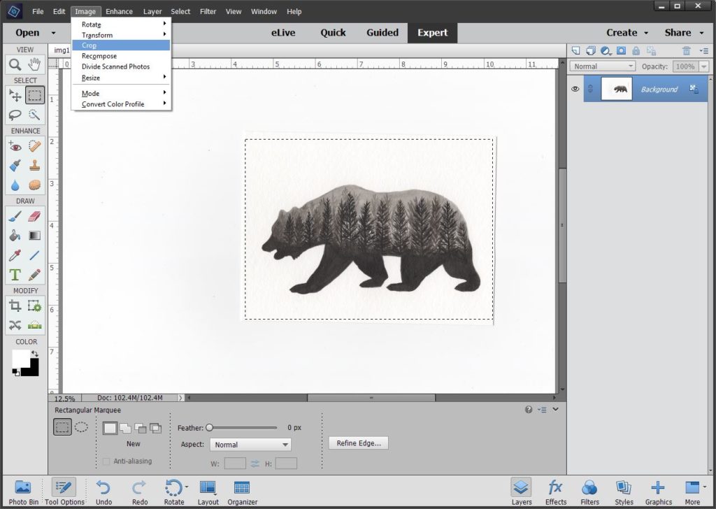
To do this, click the Select tab at the top of the screen, and then Transform Selection.
![]()
Little boxes will show up, and you move and adjust them until you are happy with the area selected.
![]()
Hit the green arrow if your happy, the red circle if you’re not. If you hit the check and want to readjust, just go back a step and repeat. Then we’ll be ready to crop. Go to the Image tab at the top, and select crop.
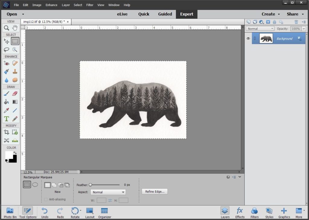
Alright now we have just our image and we’re ready to edit the image.
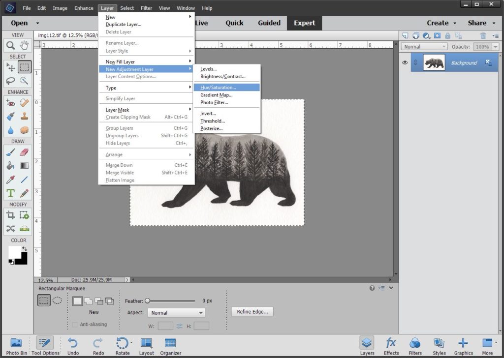
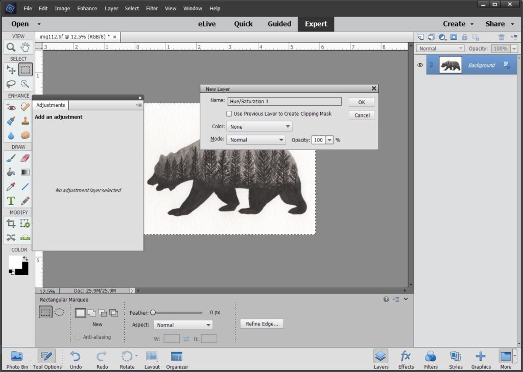
Next step, because this is a black and white image, I want to make sure that no other colors are showing up. From the Layer tab at the top I’ll select Hue/Saturation.
Here I’m going to just hit OK. I do sometimes name these something different, but this is a simple case and not necessary.
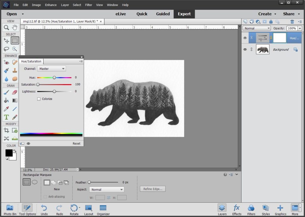
I drag my saturation to -100. (Just as a side piece of information in here, when I do drawings on black paper with white, I only take the saturation down to -40. In real life the work has a bit of a cool tone, and after some playing with it, this makes it look pretty close to the original. I can also do this with my printer, but this adjustment works really well for me.)
Moving on.
Next we need to fix the levels. You’ll notice how my white paper looks a bit dingy and the black looks faded. From the Layer tab at the top this time I’ll select Levels.
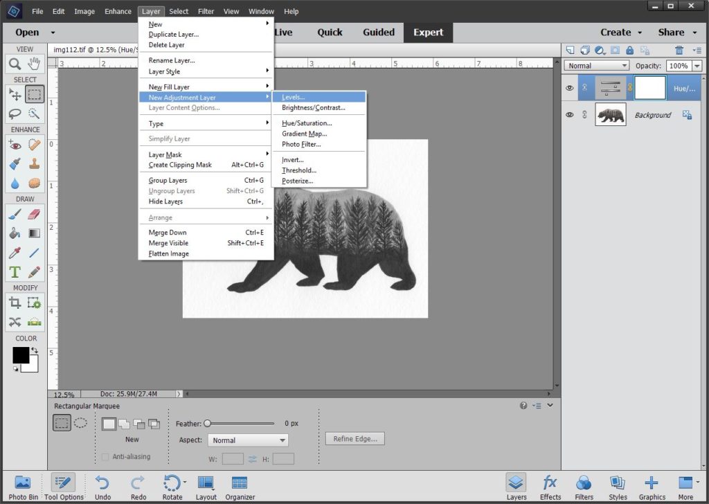
You’ll notice when you click the levels that my hue/saturation window pops up. This is normal, just click OK.
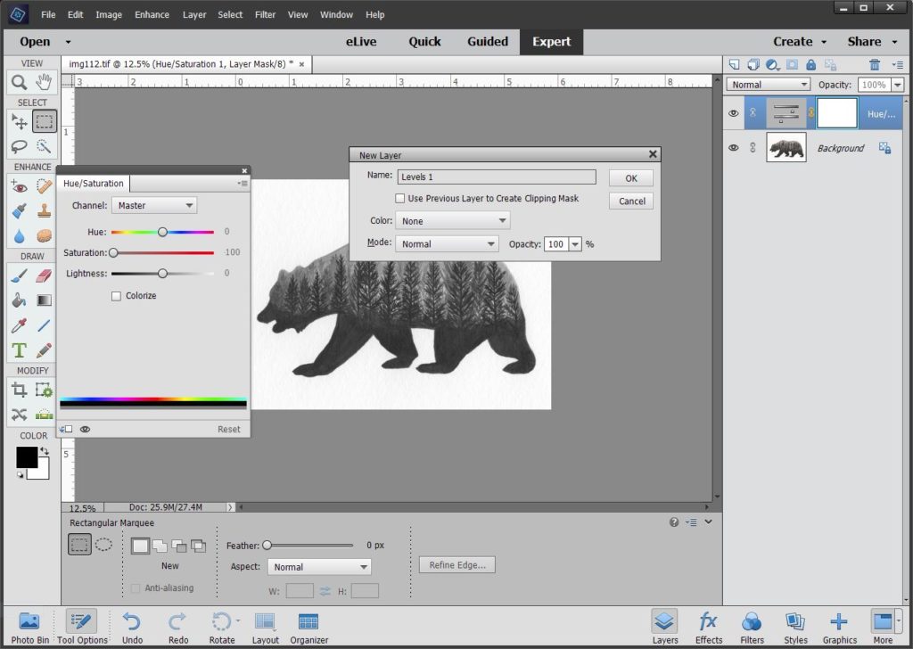
The order of these two steps changes depending on if I’m working with a black and white image or a colored one. I always do hue/saturation first on black and white, but I do the levels first on colored works. The initial screen looks like this.
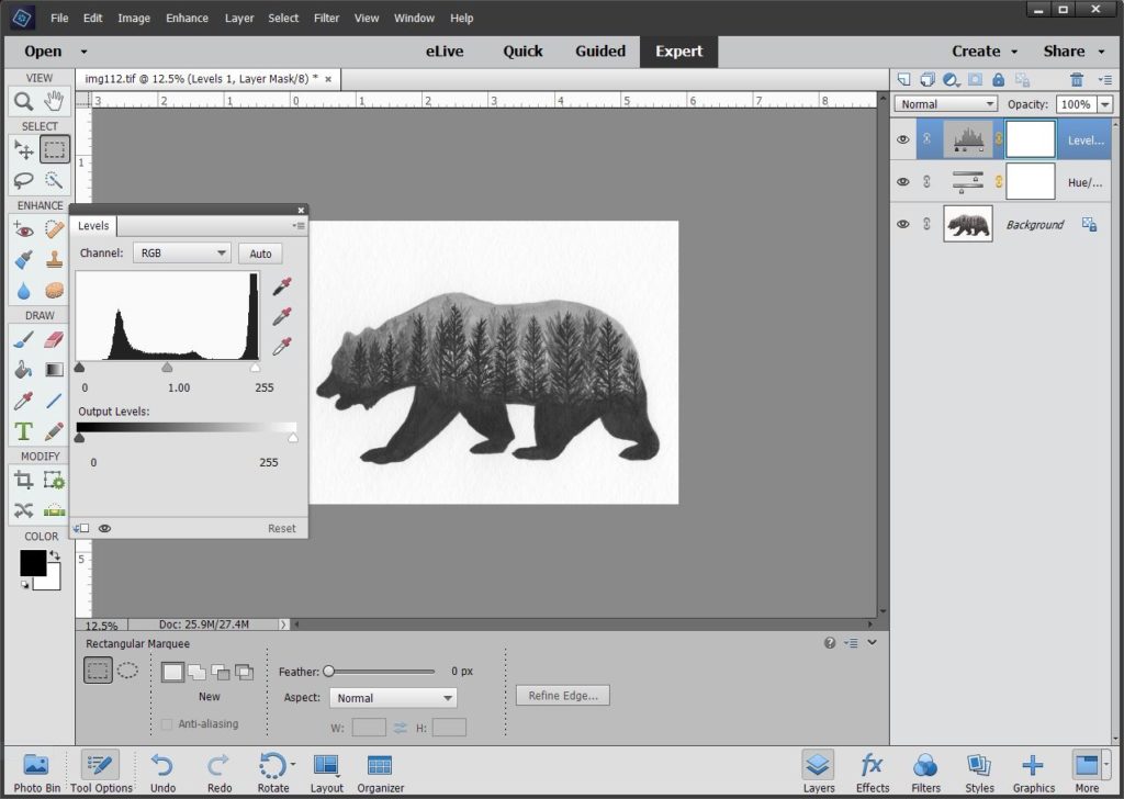
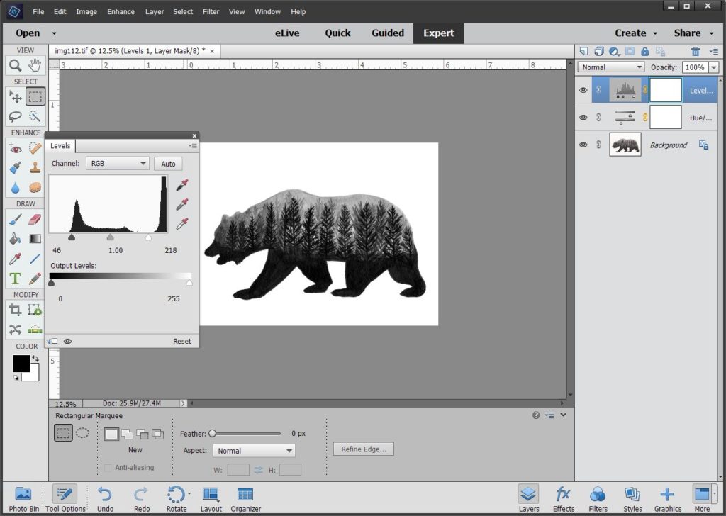
The numbers that I focus on are below the histogram. Drag the little arrows left and right until you feel like your picture looks right. I would say until it matches the original, but that’s not always the goal. It may take a bit of playing around with to get it right. I very rarely move the middle arrow, but occasionally it is helpful.
I’ve seen here where some people recommend using the color picker tools to the side of the levels screen. If you hit the top one and then click the darkest part of your picture it will adjust everything based on that. Same with the bottom one and white parts. I’ve always found this is too drastic of a change for my works. It ends up taking this too far. Play around and see what works for you here.
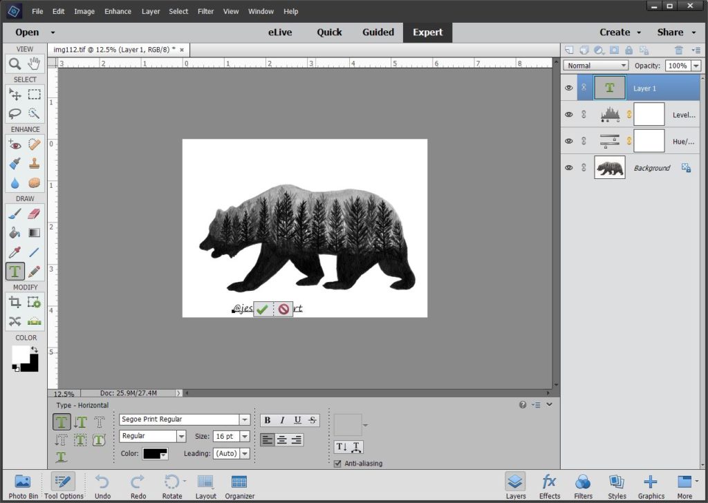
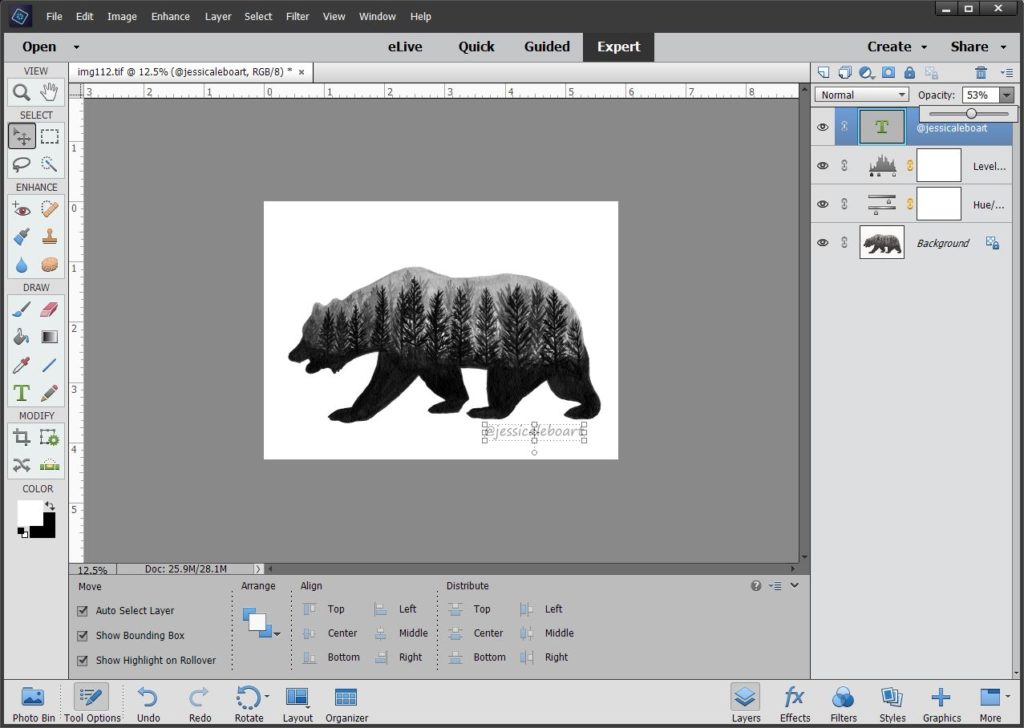
Now my image looks good. I’m going to continue on with my process of getting this ready for posting online. I always like to watermark my images. For a few reasons, obviously I don’t want someone claiming my image is their own, there are so many accounts on social media that do this, and if my picture ever gets randomly out there on the web someone can pretty easily find me. So it’s part self protection and part self promotion. (Hey, being honest here!)
I click the text tool, and then type in @jessicaleboart, then click the green check. If you look at the bottom of the screen, you can change the font, color and size there.
So here my text is complete.
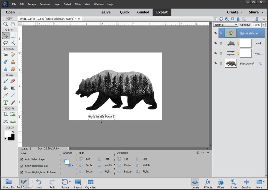
But I really don’t like the location of it, so I’m going to move it to the right some. Just make sure your move tool is selected and drag it to where you’d like it. Also in this step, I decided it felt a bit too dark for this picture. I could have changed the text color to something lighter, but I often just change the opacity level. In the top right corner you can see opacity. Once you click the down arrow, you’ll see the slider and can adjust it.
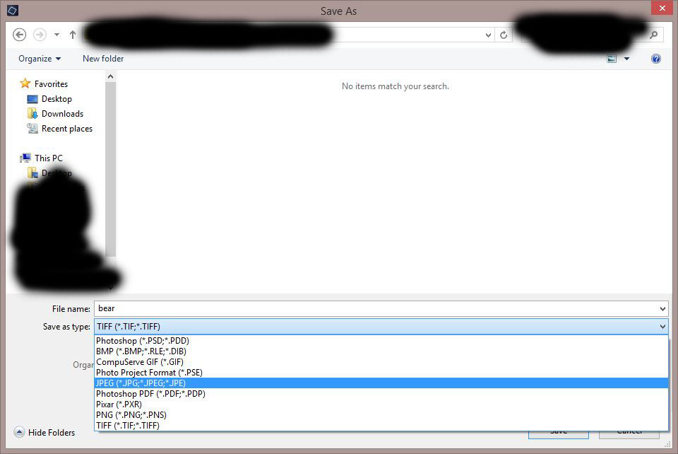
Now is a good time to save the image. When you go to save it the first time, make sure to change the file type. My dropdown looks like this, but yours may be different. I save it as a Photoshop the first time.
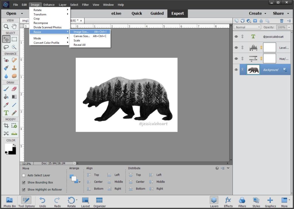
I always post my images to the web at a smaller resolution than I work with. Helps with loading time, and that whole theft issue. Click the Image tab at the top, and then Resize and Image size.
My original screen looks like this.
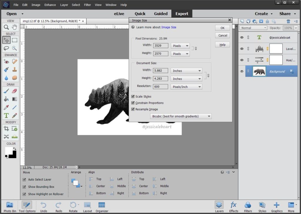
I adjust my resolution from 600 to 300, and then the recommended max pixel for Instagram is 1080, so I always put that as my largest dimension.

I then save this image as a jpeg. Be sure you DON’T resave this image as a Photoshop, because you’ll lose the original and then you won’t have a large file anymore.
Whew! That was a lot of screenshots. I wanted to make sure I broke it down very far for this one, because I know that sometimes tutorials skip some steps and it can get confusing.
As I started off saying, this is a very basic example. Some images can be completed using just these few steps. Some require a bit more tweaking. Some require a lot more tweaking.
Please let me know if you found this helpful!! It’ll probably take a few more posts to get through editing. If there is a specific editing topic you need help with let me know!
Thanks for joining me here!