Author Archives: jessicaleboart

Printing at home.

Welcome!

Throwing in another printing post today.  I’ve been trying to figure out a way to deal with a printer dilemma and decided to take a break and talk about my printers.

Why do I want to print at home?  Well if this is the first time you’re reading my blog I’ll recap super briefly.  I tried outsourcing and it was a miserable terrible experience.  The prints weren’t all that great, customer service at some places wasn’t great, and I hate waiting on shipping.  It’s also hard to know what you are going to need.  I don’t want my customers to have to wait for a third party company to ship me the prints if I only order when needed.  Plus this would drastically increase costs, even just in shipping!  So printing when I want is a huge huge bonus for me.  Why not use a drop shipping company?  It goes against what I want for my business.

(Mandatory disclaimer:  I don’t care what you do for your business! My opinions are only regarding my business!  I can be completely supportive of your decisions even if they go against what I personally like, so don’t think I’m being critical of you if you chose another route.  That’s what makes this all fun, we’re allowed to have different paths!)

So now that you know why I want to print at home, here we go!

I have three printers I use.  The first is a Brother all in one laser jet copier, scanner, printer.  It works fantastically for words, and I print my references on it.  (Which is an entirely different post!)  It prints shipping labels quite nicely as well.  And that’s where its capabilities end.  So it’s more on the admin side of my artwork.

Onto the art printers.  I have two Epson printers.  The Artisan 1430, and the SureColor P800.  Why two?  Well, I bought the Artisan first and it doesn’t print black and white very well.  At all.  And, well, if you’ve seen my work lately that’s a bit of an issue.  So I did more research and bought the P800.  If I could do it again I’d skip the Artisan to start with.  But live and learn, and make expensive mistakes is the motto of starting a small business!

Alright so some general specs on each and then I’ll give you more of my rambling opinions on each and what they’re good for!

The Epson Artisan 1430.  Ranges from $300-400 US dollars depending on where you buy it and if you’re getting a sale and/or rebate.  It prints max 13×19 inch images.  It’s wireless (isn’t everything these days though?!)  And has 6 ink cartridges.  Not a tiny printer at 24x13x9 inches.  A set of replacement ink will cost around $138 from Epson.

The Epson SureColor P800.  Ranges from $800-1300 US dollars again depending on where you buy it and if you’re getting a sale and/or rebate.  It prints max 17 inches wide and you can attach a roll to it and print for miles.  Kidding, you can only print up to 129 inches.  The roll attachment is a separate purchase though and doesn’t come standard.  It’s also wireless and has 9 ink cartridges.  This printer is big.  It’s 27x15x10 inches and takes up some space.  When in use it takes up even more space.  A full replacement set of in costs $540 from Epson.

So now that the boring stuff is outta the way, let’s talk real actual opinions!

The Artisan is great for color printing.  It’s not a disastrous amount of money.  It works great.  The prints are fantastic.  It can handle decently thick paper.  I’ve run sheets of Bristol through it with no problems.  It’s a bit smaller which is nice.  If I printed all in color, this would be a great printer.  Well, as long as 13 inches wide is enough.  I print wider all the time.  I actually wish I had a printer that could print 23 inches wide.  But I haven’t won that lottery that I don’t play yet, so we’ll just stick with 13 and 17 inches for now!

The one downfall is it can’t print black and white.  I Googled and searched forums far and wide to find a solution, but it’s the same issue.  It prints with a tint to it.  Which is actually a pretty common thing.  Even prints from third party companies have this issue at times.

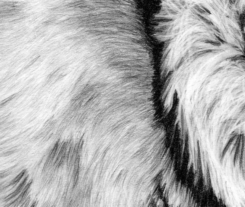
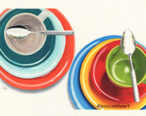
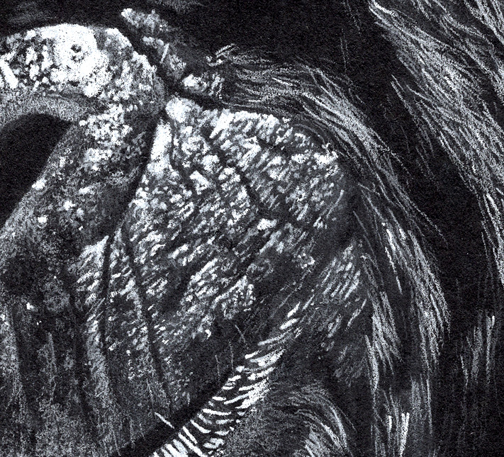
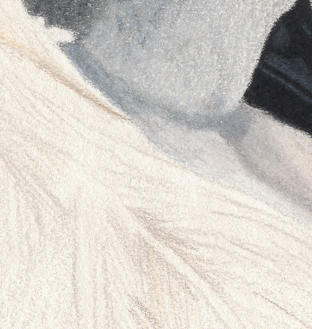
Here’s a picture to show what I’m talking about.

black and white photos have a tint

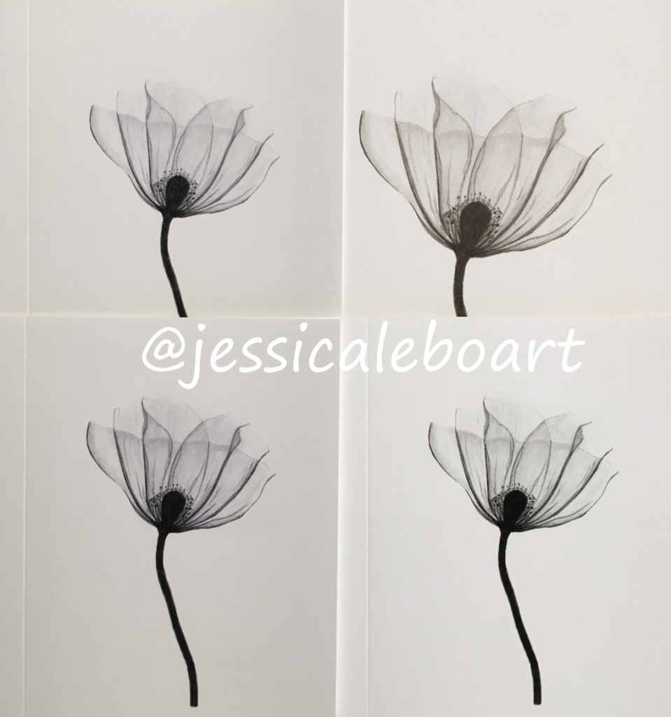
Now I didn’t edit this photo at all because I didn’t want to change the differences.  So please excuse that part.  But the cards themselves are white.  The top right is printed on the SureColor P800.  The other three on the Artisan.  The two on the left are two attempts with standard printing using different settings.  They both have a very serious bluish purple tint.  The bottom right is forcing the printer to only use the black ink by printing in grayscale.

(Oh man, this picture may need to be taken again trying to get better lighting.  The sun is even shining outside and it looks not so great.  I can see the differences easily, but then again, I’ve stared at these images for hours. If you can’t tell the differences, you’ll just have to trust me on this one.)

So with this flower it really doesn’t matter so much that it has a blue tint.  I mean we could just go for it and call it artistic.  It is a flower after all.  But a lion?  Yeah, blue tints don’t look quite so good on my big cats.

The grayscale isn’t too bad either to be fair.  For flowers and simple items.  But again.  A detailed animal?  It just doesn’t work.  You lose so much detail and it comes out looking really off.  So for some images the Artisan can pull off a black and white, but most of my work it can’t handle.

So I bought the SureColor P800.  The difference comes with the ink.  The P800 has two black inks and then a light black and a light light black ink.

Ok.  Slow down.

Two black inks?  It has an ink that it uses when you are printing on a glossy/luster paper, and then an ink that it uses when you are printing on a matte paper.  To switch papers, you have to switch inks.  Which wastes ink.  Takes a few minutes for the printer to switch.

Yes, this is just as annoying as it sounds.

Very annoying.

So I don’t switch very often.  I try and print all of my matte prints on the Artisan and all of the glossy prints on the P800.  I really only do small stationary cards on matte paper anyway.  At least at the moment.  If I ever start doing volume then it wouldn’t be as big of a deal to switch inks and just be mindful of printing them all in batches.

But anyway, back to the multiple black inks.  When you print with three shades of black you can get all of those wonderful details in there.  Kind of important to me.  I love details.  Three black shades can give you detail you just can’t get from only one black ink.

The other nice thing about the P800 is the ability to print in either warm or cool tones.  For my graphite work I always print warm.  Pencils aren’t true black and white.  They aren’t neutral.  They have this ever so slight brownish tint.  Seems crazy maybe at first.  But if you look closely at my picture above.  The top right one matches the original the best.  It’s pretty close, and I like that.

Now if matching the original isn’t your goal, and it certainly doesn’t have to be, then maybe this isn’t an important feature for you.

I also like that when I print my black paper drawings I can print them slightly cool.  This gives it that natural bluish tint that mimics real life.  It’s super easy to do with this printer.

If I could figure out how to apply a mask to the file and print with my Artisan and get the same warm tone, I’d be thrilled!  (Hey, if you know how to do that in Photoshop Elements and it actually works for me, I’ll send you a free greeting card of your choice to say thanks!  Seriously!)

The other nice thing about the P800 as I’ve mentioned is the larger print size.  Still wish it was a pinch larger, because when you’re leaving a border you only really get a max width of 16 inches.  But I have to work with what I’ve got, and it’s better than the max with border of 12 inches on the Artisan.

Touching on replacement inks because they seem to be a lot of fun.  They are expensive.  There are cheaper knockoffs and such.  I’ve never tried them.  I just try to remind myself that this is an expense of doing business.  Yes, I agree it’s no fun feeling like you have to sell a kidney when you have to buy replacements.  It all goes into the cost of printing at home though.  When you buy from a third party printing company you’re still paying for ink costs, you just don’t think of the break down.

There are other brands of printers out there that work well for prints.  But after researching a lot I decided to go with Epson.  So really it’s the only ones that I can talk about personally.

So there you go my printer ramblings for the day!

Have any questions?  Any other topics you want me to ramble about?  Just leave a comment, send me a message, or track me down on social media!  I love hearing from you!

Thanks for reading, and have a wonderful rest of your week!

Jessica 🙂


It’s all about practice.

Welcome!

Today’s post is a bit different.  Today we’re going to talk about my banjo.

(Stick with me for a minute on this one!  I am going somewhere with this, I promise.)

Seriously.  I own a banjo.


There it is.  Sitting in the corner of my bedroom.

So now I bet you’re thinking, “Wow, Jessica plays the banjo.  How awesome!”

Wait.

No, I don’t play the banjo.

I own a banjo.  I want to learn to play the banjo.  Earl Scruggs.  Bela Fleck.  Steve Martin.  Ron Block.  Aaron McDaris.  Just a couple names thrown out there.

So then you might be wondering…

“How often do you practice?”

I don’t.  Ever.

It sits in the corner of my room and literally collects dust.  A constant reminder of a goal.  But I do absolutely nothing about it.

Every year when making a New Year’s resolution list, I add ‘practice learning the banjo’ to the top.  And I last a few weeks, maybe.  Then I get distracted and stop.  Glancing at it daily.  Thinking I should at least put it in the case.  But then I’d definitely never pick it up.  So I just leave it out.  So I can see it.  A reminder.

So by now you should be thinking, “How are you going to learn if you don’t ever practice?!”

And now we’re to my point!

How are you going to learn to draw, paint, create, or do anything else if you don’t practice?!

Want to be a better artist?  Practice.

Want to learn a new skill?  Practice.

You don’t learn by doing nothing.

I am not learning to play the banjo by listening to the Steep Canyon Rangers all day.  Sadly.

I am not learning to play the banjo by spending hours on YouTube watching bluegrass musicians play their banjos.  Unfortunately.

The only way I’ll learn is to suck it up, pick up the banjo, and practice.  (After I take it apart and give it a good dusting!)

I am asked a lot by people looking to improve their drawing skills what they can do to improve.  It sounds very simple to say practice.  It is that simple.  Pick up a pencil and paper every day.  Draw something.  Draw something harder than the last thing you drew.  Draw the same thing you last drew.  Draw anything.  Just practice.  Every.  Single.  Day.

Feel free to insert any other verb in there if you’re not looking to draw.  It applies to everything.

I use this banjo example because it seems really obvious.  For some reason it makes sense to people that you have to practice a musical instrument to get better.  But then you talk to an artist who is just starting and it seems like a foreign concept that it’s all about practice.  It doesn’t matter if what you are drawing is ‘good’ or not.  It’s the practice that counts.  The time spent is never wasted.  It all adds up.  No one starts playing an instrument and has it sound good.  And we all accept that and understand.  Drawing is no different!  It’s ok to not be ‘good’ to start with.  It’s normal.  Accept it!

I wish sometimes that I had a magic answer for people when they ask how I got to where I am with drawing.  But I just spend a lot of time drawing.  A lot.  It would have been nice if I had just woken up one day and was where I am, but it has taken a lot of work.  A lot of practice.  It will take a lot more work to get to where I want to be.  A lot of practice to learn the things I want to learn.  It’s never ending.

Just practice.  Then practice some more.  Then when you’re tired of practicing… do it some more.

I’ve been working on some really cool post ideas, so I’ll see you soon!

Thank you for reading!  Hope you are all having a wonderful day!

Jessica 🙂


My favorite drawing supplies!

Hello again! (Or hello the first time if you’ve never been here before!)

So I talked about paper, the next step is supplies.  I’m only going to talk about my favorite drawing supplies today.  If you thought my paper obsession was ridiculous, my art supply stash is insane.  I love everything art supply related.

You know how people joke about what they’d buy if they won the lottery? Well, I’d buy an art store.  Because I want all of the supplies in the whole thing to play with!  Not to actually run the store, but to be allowed to play with it all.  Not kidding!

I use so many different types and fun things, but we’ll just talk about the drawing stuff, because that’s the art that I’m decent at creating. Continue reading

Examples and close ups of paper types.

This is the second paper post.  If you haven’t read the first one yet, click here and go read it first, this one will make much more sense if read second!

Alright here are my examples of each of the papers I’ve mentioned.  I have included the picture and then a super close up scan to show the texture of the paper.  Some of these pictures are old, and not the best.  I had to go back a bit to find examples of some of the paper types.  And I’m a bit better at drawing now, so you know, forgive the badness.


Strathmore Bristol Smooth 300 series

A pretty simple flower drawing.  I don’t have a lot of drawings on this paper.  It’s a good paper and a lot of people use it, but I would personally pick the vellum for graphite over the smooth.  But only for the 300 series.  This paper is super easy to find locally as they stock it in so many places.

And close up.


Strathmore Bristol Smooth 400 series

Swoon.  I love this paper.  I feel like for this paper I could add half of my recent works.  I love this paper.  Love it.  I’ll only put one here, but this is my most used paper recently.  Did I mention I love this paper?

And close up.  I can get layers of fur in.  And it erases nicely, which helps so much for crazy, messy fur.

Strathmore Bristol Vellum 300 series

A graphite drawing first.

And a super close up.  The 300 series vellum has much less texture than the 400 series vellum.  I like this paper for graphite.  And if I didn’t like the 400 series smooth even more, I would use this one.  I have quite a few graphite drawings on it.  If I was going to pick from the 300 series only, I’d choose the vellum.  It’s actually much closer to the 400 smooth.

And for colored work this bird turned out not too bad.  You can see the background is a bit blotchy from my attempts at using mineral spirits.  But overall it’s not terrible.  I just wouldn’t use mineral spirits again on larger areas.  Which is a common problem for cheaper paper.  This isn’t nearly as bad as some papers though in that regard.

This was done with burnishing and it turned out nicely.

And close up, the black reflects some scanning light, so I feel like this one actually looks better in person.  You can see that it really is fairly easy to cover the paper, and it doesn’t have too bad of burnishing marks.


Strathmore Bristol Vellum 400 series

My bear at fish pass.  Isn’t he such a cute little guy?!

And close up you can really see the texture of the paper.  It’s really a bit too rough for the way I like to work with graphite on animals.  It is hard to erase fur highlights.  Getting all of the paper filled in takes a lot of effort for dark areas.  But the darks do get fairly dark which is a huge plus.

And a colored pencil piece.

And close up you can see that it really took the pencil smoothly.  Even with mineral spirits.  I would absolutely use this paper again for color.  If I ever decide to spice my life up again and dust off the colors!

Strathmore Bristol Plate 500

Haven’t used this paper yet.  I do have the outline done though.  Big surprise.. it’s a lion.  I know, isn’t that shocking?

Strathmore 400 series Drawing

This paper is a bit interesting.  It is too thin for a perfect paper, and has a bit of texture.  The wolf picture below is a photo, not a scan.  Mainly because it’s 18×24 inches, matted (but not framed), and hanging on the wall in my art room, and has been since I finished it which was before my scanner days.  It’s one of my favorites.  (Even though I’m tempted to redo it because I know I could do a better job nowadays.)  But it has an off white tint, and that makes print making a bit interesting.

And another favorite drawing that is on this paper.

Here is a close up when I’ve taken the paper to a white through editing.  The texture was perfect for my crocodile.  It helped add so much to the picture naturally.

And here is the original unedited scan.  Now keep in mind this is way off from reality.  The paper isn’t quite this creamy colored in real life, and the darks are much darker in real life.  But I’m throwing this in here to show that it really isn’t white.  And does require some additional editing for prints.


Strathmore Colored Pencil

This paper is definitely off white as you can see here.

I only got a handful of layers on this paper, but it did work decently with mineral spirits.  If it was a heavier paper, maybe it would be an ok choice.  You can see from this close up that it does have a bit of tooth.


Strathmore Artagain

This is another paper I love.  I love love it.  This is the only black paper I use these days.  Although I do have a sheet of another brand.  I’ll test it eventually.  Who knows maybe it’s even better, I doubt that’s possible though.

And super close up.  Ooh this one almost is a bit too close.  I feel like he’s sniffing me.


Canson Bristol Smooth

I use this paper mainly for ink, but it works just fine for graphite as well.  I personally prefer the Strathmore, but I have no problem using this for smaller pieces like this water lily.

Close up.


Canson Bristol Recycled XL

Graphite chimp.

Close up:  see all those black specs?  They are in the paper, not loose graphite particles.

And for colored pencil.  This paper is disastrous.  Close to nightmarish.

It doesn’t burnish well, and mineral spirits are impossible.  Here is a close up of the sky.  Just ugh.  No matter what it was streaky and blotchy.  Doesn’t burnish at all.  Just run.


Blick Studio

I’ve used this paper for a couple of graphite drawings.  It’s not terrible.  Not earth shattering amazing either.  It’s a step up from a sketch pad though.

Here is a simple colored pencil drawing.  I tried mineral spirits on the blue background, and it didn’t work too well.  The paper overall was good for a simple drawing though.


Stonehenge Vellum

This is a great paper for some things.  Bad for others.  First this lion.  I don’t like rough paper for fur.

The highlights don’t erase on this paper well at all.  It’s just not a great eraser paper for me.  You can really see the texture below.  Even the black parts of his mane were really hard to get all black because it has just so much texture.

But it’s the perfect paper for this guy.  The texture of the paper just adds to his natural wrinkles and makes a perfect combination.


And close up.  I love the way this drawing turned out.  So this is a paper that I’ll use for no fur or hair, but if they have texture, wrinkles, bumps, perfect!


Stonehenge Sheets

Nothing yet, but I’ll be sure to come back and add photos once I use this.


Arches Hot Pressed Watercolor

A graphite drawing.  Like I’ve mentioned this paper is soft and can snag easily with a sharp point.  But it is a wonderful paper in my opinion.

I really tried to get a close up on the sections where I could show the snagging I’m talking about, but even at a super zoomed in scan you can’t see them.  The just don’t show up.  I think I’ve mentioned I love this paper.  I’m actually almost finished with another large drawing on this type, and it is a little harder to get the super detailed layers that I like from the Strathmore Bristol smooth.  The paper is just softer, and therefore lends to a bit of a softer overall drawing instead of super sharp and crisp fur.  It’s not a bad thing, you just have to realize it going in.  I’ll probably come back and add a close up of it here when I’m finished to demonstrate what I’m talking about.

And a colored pencil drawing.  The background on this picture is a bit of a disaster.  But that is completely user error.  I had no idea I would actually end up liking this picture.  So I drew it with the watermark of the paper taking up the entire bottom right corner.  Then I had to make it darker to cover it, then I tried to make it blend with the rest of the paper, and I was way too many hours and layers in give up.  But I learned a lesson: don’t draw on a watermark.  They can’t be covered up easily and smoothly.  The colors will blotch up and you’ll spend hours making a mess and attempting to clean it up.  Why do they even make them so huge anyway?!

Close up.  The turtle part looks not too bad at least.


Fabriano Artistico Hot Pressed Watercolor

This paper is alright for me.  I would use it if it was laying around, but wouldn’t go out of my way to buy it again.  It doesn’t erase as cleanly for fur as I’d like.  Certainly not a terrible paper for graphite though.

And close up.

Also an alright paper for colored pencil.  A lot of artists really, really love this paper.  I personally would rather use Arches, but this paper doesn’t snag like Arches does.  So that’s definitely a plus.

And close up.  The blending is fairly smooth.  It does seem to collect these dots of color for me.  Which is very possibly my fault, but I don’t have this issue with other papers, which makes me wonder if maybe it’s not user error.


Canson Mi-Teintes

Here’s a white paper drawing on the smooth side.

And close up.  You can the texture here pretty well.  I was using a very sharp black pencil to try and get these twiggy things drawn.  Detail just isn’t happening for me on this paper.

And here is the black paper.  It doesn’t look too bad from this view.

Close up you can see how much harder it was to cover the whole paper.  It’s difficult to get smooth for me.

And a scan of the back just to show the rough side.  It has a very distinct pattern to it as well.  Total side note:  this is also how I label my drawings.  The date finished, paper type, pencil type, and if I use fixative.  I also include where the reference is from and the photographer or user name of the photographer, but they were off to the other side.


And that folks is the conclusion for now.  I’ll update it as I continue to add to my experiences.  Please let me know what your favorites are!  Have I completely missed yours?  Please let me know!


If you’d like to get postcards with my art on them in the mail, sign up below.  Find me on social media as well.

SUBSCRIBE

Paper, paper, paper! Oh how I love paper.

Hello there, welcome!

what paper should I use to draw on

Ahh, so pretty!

Today I’m going to tackle (or attempt to) one of the questions I get asked about a lot.  Which is normally a bit weird for me, because I have to figure out how to answer the question in a few sentences.  Well not today.  Today is a go get a cup (yeah, maybe you should just get the whole pot) of coffee and sit back and learn way more than you ever wanted to know about my paper obsession. Continue reading

Where to go from here?

Hello there!

Sorry it’s been a bit since the last blog post, but I’m a bit stumped for what to say next.  So I’m turning it over to you.

I had intended to do more editing posts, but haven’t gotten a lot of great feedback saying people want or need that.  I’m absolutely willing to do some, but they take me hours to put together so I want to make sure they are helping someone before I spend the time.

As far as print making goes, I’m not sure what else there is.

So, did I miss anything you’d like me to cover?  Want my opinion on anything print or edit related?  What would you like me to ramble on about next?

I get at least a couple of requests a week about drawing tutorials and tips.  I’m trying to figure out a way to get that to come across the way I want it to.  But if that is something you’d be interested in please let me know.  I’d love to hear what topics you’d like me to talk about.  What do you struggle with the most?  I’d just love your opinions on all of this.

So let me know in the comments below, or send me a message, or track me down on social media!

Jessica 🙂

Choosing a paper for your artwork prints.

Welcome.  Today I’m talking about paper.

There are a lot of types of paper to choose from.  A lot.  While I won’t talk about every single type (we’d be here all day!), I will talk about the main categories.  Glossy, luster, matte, and canvas/linen are my groupings.

My super simplified descriptions.  Glossy is what most people think of when they’re talking about photos.  They reflect light and are shiny.  Matte is the opposite.  It has no shine.  Luster is a bit in between the two.  A compromise.  Canvas has a lot of texture.

Each paper type will give your prints a different look and feel.  And really it’s a very personal choice as to which is best for your prints.  So I’ll just do what I’ve been trying to do with every post, tell you what I did and why, and then you can apply it or toss it out depending on your opinions. Continue reading

Social Media Negativity

So a bit of an off topic post today.  Just to set the tone a bit, this is not a rant, I’m not angry, not really even upset anymore, but I do have some opinions that I want to voice and put out there.

I’ll start off by saying that social media is a fairly new thing for me.  I had Facebook years ago, but never really used it so deleted my account.  Then back in December of last year when I decided to take selling my art seriously, I joined again.  I also joined Instagram, Twitter, and such.  It honestly took a while for me to even navigate around the sites.  I suppose had I used it personally it would have been much less of a learning curve when I wanted to use it for business.

I do read the news and know how to use the internet.  I’ve read so many stories out there about people being bullied and the like.  I have used YouTube for a while and have read a million negative comments there.  I knew that it was out there.  I knew it was possible.  But honestly was a bit naïve.  It never really occurred to me that I would deal with so much negativity while posting my artwork online.

Why bring this up now?

Because I can.  This is my blog, and I can talk about whatever I want.  This is a topic that has been on my mind a lot the last couple of months.  And if you happen to follow me on Instagram and have seen my stories the last few days I feel like this is an opportunity to explain while addressing the topic generally as well.

A bit of background on the current situation.  I have been working on this project that is just square section crops from various animals.  It’s really just a fun project for me to work on when I have some extra time and don’t feel like working on any of my other ones.  A follower had asked me if there was going to be a giveaway at the end when it is finished.  I said yes, I had been thinking about it from the beginning.  I thought it would be a fun idea.  Hadn’t really gotten to specifics yet, but something along the lines of most correct guesses, and maybe some additional random participation?  I had just started an animal and thought it would be a fun interaction to post it to my story and send a free greeting card to any correct guesses.  It had a very identifying factor in it.  It was the bottom of a panda eye.  I knew that if I put too much detail in, many people would guess.  So I posted a picture after only the first layer of drawing.  I wanted fun and engaging, not to be sending hundreds of free cards out though!

A lot of people had fun and guessed, some guessed multiple times.  Some really fun conversations were had.  But there were some people who got really upset.  They felt that I had made it too hard, and didn’t draw anything before having people guess.  Said it was just lines, and looked terrible, and was completely unfair.  Had someone respond saying they weren’t going to guess because they didn’t want my bad art as a prize.  Honestly, there was nothing forcing anyone to participate.  I was really kind of shocked.

One person guessed correctly.  So I posted a picture of the card in my story, along with a list of the guesses.  I included some of the negative ones, although not all of them.  I debated leaving them out.  But felt like including them to point out the ridiculousness of some of the responses.  It wasn’t out of anger or anything, just hoping to make people think for a second.

But… it opened the floodgates of nastiness.  A few were furious that someone had actually guessed correctly and was getting sent a free card.  Then there were people who were mad that I posted the negative responses.  Why send them in the first place if you’re going to be mad that I post them?  I didn’t include names.  I wouldn’t have ever done that.  It would come across as petty, and probably would be if I had used names.  I suddenly had people calling me an idiot, stupid, among other things that I won’t repeat, let alone post.

Over a free greeting card??!! 

You can buy one for $5.00 on my website here or in my Etsy shop.  That’s the cost of a cup of coffee or a McDonalds sandwich.  It’s not that serious.  It is a card.

Which makes me think, maybe it’s not just the card.  Maybe people felt like they needed to attack someone.  I have no clue.  It makes no logical sense.  But I’ve gotten other negative responses at times in regards to my art.  People saying they don’t like it, it looks wrong, I used the wrong colors, drew a part wrong, I’m not as good as other artists, I ruined it by doing certain things, I need to graduate and draw in color, real artists draw people, I should draw this or that instead, it’s not very good…. I really could go on.

Did I ask for any of those comments?  Of course not.  I don’t have thick enough skin to ask for critiques of my work.  Which leads me right into people’s responses if you mention someone said something rude.  They say you have to have thick skin as an artist, just ignore them, don’t let it bother you, don’t feed the trolls, it doesn’t happen that much… and again I could go on.

I’ll pause here for just a second.  These responses are not from people who are normally trying to be supportive.  They come across as harsh and with an attitude.  Sometimes really well meaning people will use the same words, but there is a difference.  I think we all can think of examples of the two different types of people I’m talking about here.

I completely disagree with some of the standard responses.  I do not have to have thick skin.  If I’m going to galleries and presenting my work, yes maybe I need thick skin to handle the rejection.  You need perseverance and determination.  But thick skin?  To handle people being rude and mean?  How does that make sense?  These aren’t people who would buy artwork, they aren’t gallery owners.

Ignore them, don’t let it bother you?  Yeah easier said than done.  I understand that dwelling on it isn’t really the best option.  I get that, but it’s really hard to just ignore a bunch of negativity.  Have you ever had someone be rude or mean to you?  Did it upset you?  You can probably think of a time that you got upset.  So why is your advice to others don’t get upset?  Seriously think about it.  When you are upset about someone who was rude to you, is the first thing you want to hear, don’t worry about it?!

Don’t feed the trolls.  Oh I love this one.  So the trolls can go around saying and doing whatever they want, and normal nice people are supposed to ignore them?

How in the world does that make sense?  Yes, I get not engaging and fueling the flames to an extent, but to just ignore them and not speak up and give your side a voice?!  That’s crazy.  That’s giving them all of the power to continue to be rude and mean to others.  What happened to standing up for what is right?  What happened to defending yourself?  Are we just supposed to put up with it and deal with it, letting them continue?  Possibly moving on to someone else?

Think about this.  Aren’t these responses blaming the person who has received the mean/rude messages?  I hate to use the word victim here, because it’s one of those words that can be abused quite often, but a range of synonyms would be appropriate.  It completely negates any and all of the feelings, and makes it wrong to speak out.

If you are someone who has never had someone send you a negative message then maybe this isn’t making any sense, and sounds like an awful lot of whining.  Honestly, I think you should count your blessings and be thankful you’ve never run across the issue.  And if you ever do, and need someone to vent to or a proverbial shoulder to cry on, look me up.

How do I wish people would respond?  Hmm.  Good question.  Maybe with a bit of sympathy and/or compassion.  Just because it’s happening to me now doesn’t mean it won’t happen to you next week, or next year.  Or maybe it’ll happen to someone you know personally.  How would you want people to respond if it was your sister, or friend dealing with mean people?

This isn’t just about my art or me.  It’s about the way we treat others.  It’s about the people who sit behind a device and think it’s ok to be nasty to complete strangers because they are just typing on a keyboard.  It’s not ok.  I know that at times people can be overly sensitive and overdramatic about what bullying really is.  I get that there are times when people need to toughen up, just suck it up and deal with it.

It only takes a quick Google search to realize that nastiness happens daily.  Read through the comments on any social media platform.  You’ll find a ton of random people and their rude comments.  It’s a real thing.

Since joining social media, I’ve tried really hard to be nothing but encouraging to others.  I’ve failed at times.  We all do.  We’re human.  Some days it takes a bit more effort than others to remain positive and nice.

Sometimes we have a million other things going on in our real lives that make it hard.  But other people have things going on in their lives that we don’t see as well.  Maybe today is the day they need that kind word.  Maybe today they are in need of an encouraging person to run into their path.

Think of all of the real life problems out there.  It really makes someone calling my art terrible seem extremely insignificant.  It makes someone calling me an idiot seem absurd.  But it’s not always about just that one statement.  It’s about the combination of life circumstances.  Which is why it’s really just important to remember to be kind.  Be humble.  Be encouraging.  Be compassionate.  Be that one person that stands out as being overly nice.

It takes each of us making an effort to make the world a better place.  It’s worth the effort.

Thanks for reading, and I’ll be back soon with the next normal post.

Jessica

What to do when you get your test prints in the mail.

Hello there!  Welcome.

So you go to the mailbox and your test prints have finally arrived!  Now what?  I know that the first reaction would be to get your originals ready to compare.  Don’t.  Leave the originals away for just a few moments.

Sit down.  Open the package.  Were they packed well?  For small prints it’s pretty hard to mess this up, but still take note of their process here. Continue reading

Choosing a Printing Company.

Welcome!

So you have your files all ready to order prints, now what?  This post will be about using a third party to print.  Printing yourself will be another day.

I’ve gone back and forth so many times on how to word this post, and I’m still not certain the best way to say some of this.  I keep debating whether to share all of my mistakes or just tell you what I really wish I had done.  My experience involved a lot of wasted money and even more needless tears.  After hours and hours and hours of research it was so disappointing to not actually have gotten anywhere.

So you have your plan right?  You know what your end goal is, correct?  (If not, stop and go read my last post about making a plan!)

The next step is to order some test prints.  From multiple places.  I know it may seem crazy upon first reading, but trust me on this one. Continue reading