Hello there! Thanks for joining me.
It occurred to me that I haven’t really mentioned the importance of having a good computer monitor in this process. Well actually, I think I may have mentioned it briefly in one of the first posts, but it’s super important, so today the topic gets it’s own post!
If you search in Google for why your printed pictures don’t match what you see on the screen the first million responses will say to calibrate your monitor and adjust your brightness setting. (Seriously, go search for it!)
When most people use a computer the brightness is set very high, for editing it should be pretty low. A monitor is a light source and what you see is different depending on how bright that light is. The concept is pretty simple, but adjusting it can be a bit more complicated. My brightness is normally kept between 20-25%. This works for me. Since you have a different model than mine you’ll have to play around and see what works for you. This is the easy part of this equation.
More complicated is the calibration. How is this done? I have no clue. Honestly. I don’t understand the process. I get the concept, but don’t have any idea how it’s done. So I’m zero help on this one.
After being frustrated and thinking that my monitor was causing me issues, I bought a new one. Mine was years and years old and was acting funny and about to die anyway, so it got replaced. The new one works beautifully. So I haven’t had to figure out how calibrating works. If yours’ is newer and you don’t want to replace it, spend some time researching how to calibrate it. It will be worth the time and energy and will save hours of frustration later. Trust me.
But if you’re anything like me, you’re still a bit skeptical about how important a good monitor is to this equation. So I’ll provide some photographic evidence. Because this is a big deal.
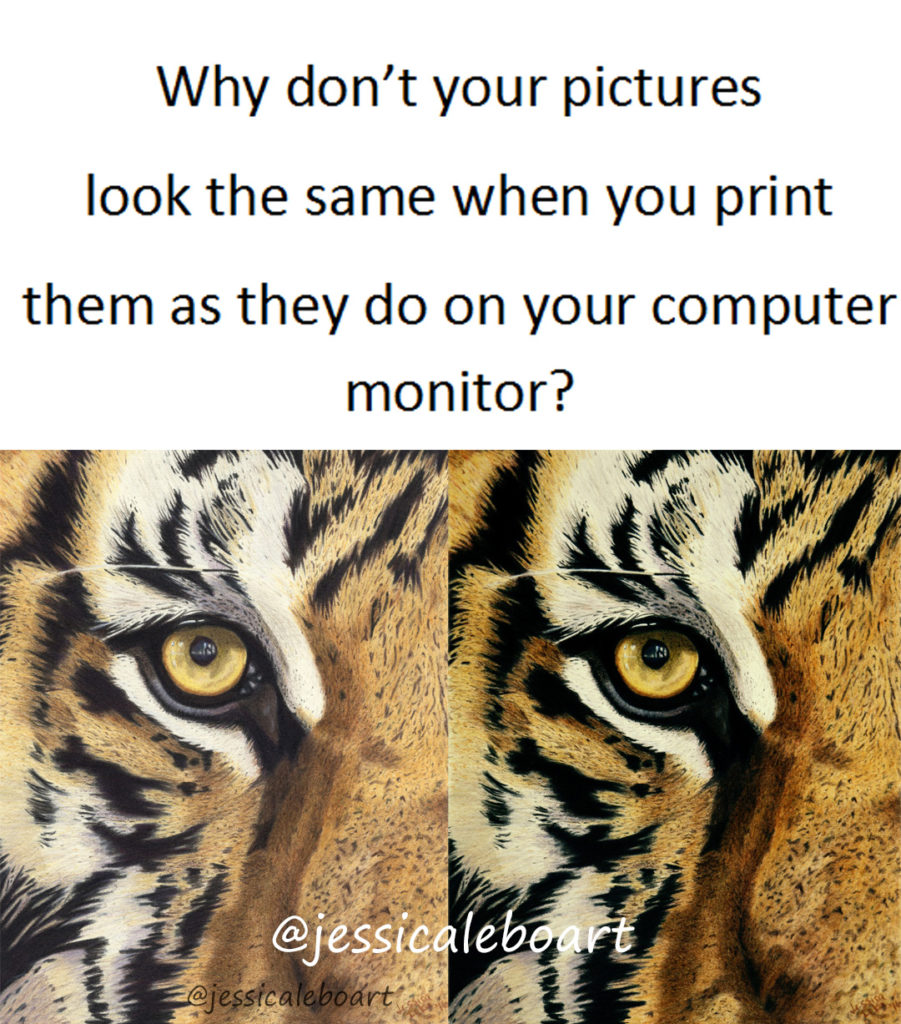
The following picture is a tiger eye that I drew. The picture on the right is edited with my old monitor, the one on the left with my new monitor. They are both edited to match the original. They look nothing alike.
Let me explain that in a different way just to make sure I’m not being confusing.
I took the picture, uploaded it to my computer, edited it to match the original that I was holding in my hand. The picture on the right matched the picture in my hand. When I would go to print it, it didn’t match.
After buying a new monitor I took the picture again, uploaded it to my computer, edited it to match the original that I was holding in my hand, and got the picture on the left. When printed it is as close to the original as I can get.
The difference between the pictures above is all because my two monitors were showing different things, causing me to way over adjust with my old monitor. I stress this because there are always those out there that will say, “Oh, you just adjusted them differently.” No, my goal is to match the original. So really they should be the same, or at least very very close.
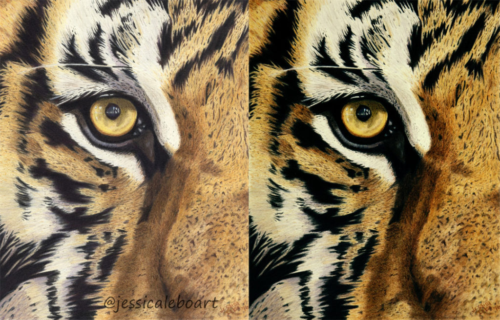
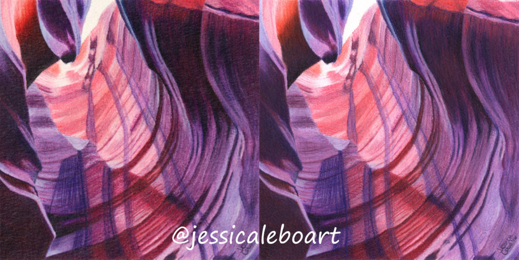
A second example. This is a small Antelope Canyon drawing.
This time the old monitor is on the left, the new on the right. I used the exact same picture to start with. Just adjusted them using different monitors. The one on the right matches the original as closely as I could accomplish.
Ok, so I said in there that I adjusted them as best as I could. So here’s another issue. My simplified version of it at least. There are colors in real life that don’t exist in the digital world. When you’re drawing with your stack of hundreds of colored pencils you can create unnumbered combinations of color. A printer cannot print every color you can create. I know someone out there will counter me and say that a CMYK printer technically has over 100 million color combination possibilities. Yeah, yeah, but put into actual real life practice there aren’t even close to that many combinations. Just because we can do some fancy math and get to a number, doesn’t mean that is what can really, actually, truly happen.
How did I figure this out from real life experience? A couple of ways. One is from the above tiger eye picture. The line of brown running down from the eye along the nose doesn’t match perfectly. I can search through Photoshop and the color doesn’t exist on there. There is no digital color I have found that matches what I produced in real life. So I had to compromise and decide that what is in the picture above is the genuine closest I can get. I’m happy with how close it is.
The picture below is another example.
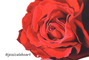
This is one of my favorite colored pencil drawings, but it has been one of the toughest pictures to edit because all of those shades of red don’t end up matching what I see in the original. If I search through the colors in Photoshop to try and match them manually, a lot of the different shades just aren’t available as a digital color. If I’m just looking at the image on my screen I don’t think it looks bad, but it doesn’t look as good as what the original does to me. So at some point, I have to decide if it’s good enough, and close enough, and just go with that. The alternative which is what I have done with this picture, is to enjoy the original and avoid printing it for now.
To summarize what my point is here. Sometimes no matter what you do to edit a photo it isn’t possible to get it to match the original. Sometimes the printed version will differ a bit from what you see on the computer screen. You just have to decide what is “good enough” by your own standards. There isn’t a right or wrong answer. You decide what works for you and then go with it! How many people are really going to be comparing your printed version to your computer screen to the original? Yeah, just you.
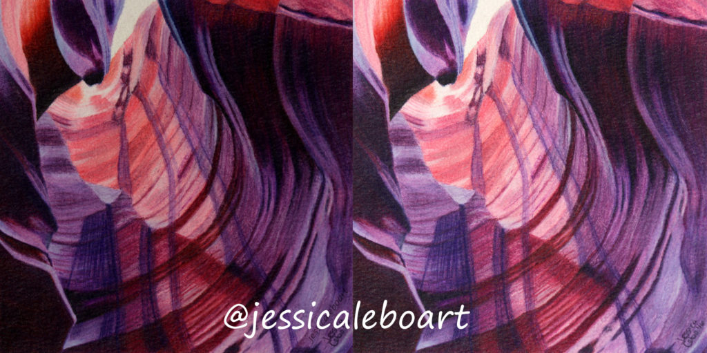
Alright just for fun I decided to scan this Antelope Canyon drawing to compare it to the photographed version. I edited them as best as I could to match the original. They are pretty close, but they do show some differences. The paper I used for this drawing is a very rough cold press watercolor paper. Because of the differences in the originals the end result is a bit different. The left picture shows a lot of light reflection because of the texture of the paper. The one on the right shows the texture but doesn’t have the same reflection issues.
Why include this comparison? Because your beginning product matters. The better your original file is the easier it will be to edit, and the better your final product will be. But, the method of getting your original file to the computer doesn’t matter nearly as much as making sure your monitor is showing very close to what will be printed. The difference in the above photos pales in comparison to the difference in the tiger eye photos. If your budget is super tight, and you have to make a choice as to what equipment is the most important, a good monitor or calibration should be at the top of the list.
I say “good monitor” but “new” may be interchangeable there. I decided maybe I should research what is considered good really quick. After looking that the prices you don’t really need “good”. My new monitor was $189.99 (yeah, of course at the moment it’s on sale for $139.99, go figure! I hate it when that happens!) A “budget” monitor is anywhere between $100 and $500 apparently, quite a range. Do some research if you’re looking for a new one, but more money doesn’t always equal a better product.
Thanks for reading! If you have any questions or comments please let me know.
I’ll be back soon, sharing more of my experiences!
Have a wonderful rest of the week everyone,
Jessica 🙂